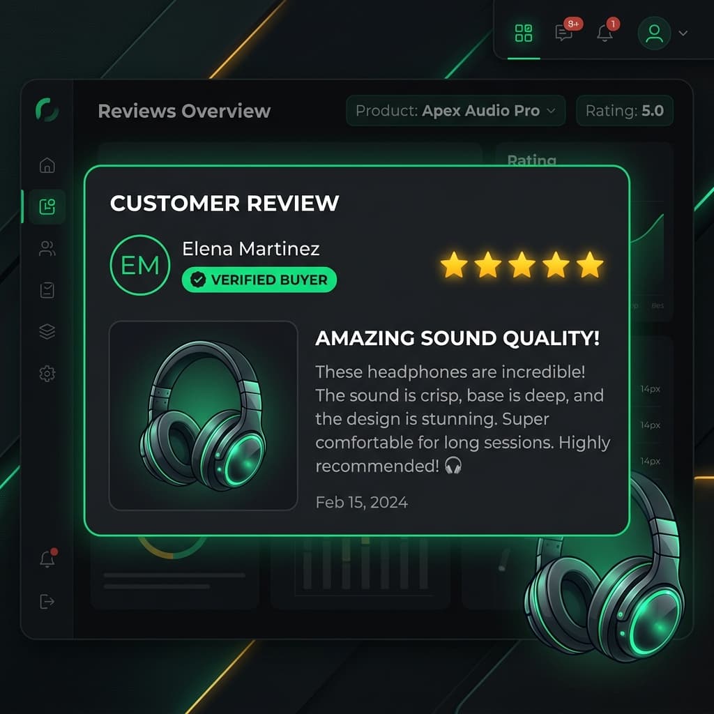
Amazon's customer review section is widely recognized as one of the most tested and optimized social proof interfaces on the web. Understanding its underlying visual structure is invaluable for UI/UX designers looking to build compelling e-commerce prototypes.
Key Visual Components of Amazon Reviews
1. Verified Purchase Badge
The Verified Purchase tag (traditionally styled in Amazon's signature orange/amber accent color) serves as the primary trust signal. It indicates that the reviewer purchased the item directly from the marketplace without steep discounts.
2. The Headline & Star Rating Bar
Unlike social media posts, e-commerce reviews pair a numerical 1-to-5 star rating with a brief bolded summary headline. The headline allows scanning shoppers to grasp sentiment in milliseconds.
3. Helpful Voting Counter
Beneath the review text, the "Helpful / Unhelpful" interaction bar allows secondary buyers to rank useful reviews higher. Including "14 people found this helpful" in your design mockups adds a layer of depth that mirrors live production environments.
4. Customer Image & Video Gallery
Reviews accompanied by unboxing photos or real-world product usage photos perform significantly higher in consumer trust tests than text-only reviews.
Applying Amazon UI Principles to Your E-Commerce Mockups
Whether you are designing a custom D2C storefront or a marketplace layout:
- Prioritize Scanability: Bold key phrases or use summary headlines.
- Maintain Neutral Palette: Use neutral grays for secondary metadata (dates, variant specs) to keep attention on the star rating and user photo.
- Support Variant Metadata: Always display the purchased item's variant specs (e.g., *Color: Space Gray, Size: Medium*).
Ethical Design Disclosure
ReviewCraft is intended strictly for wireframing, client pitches, UI prototypes, and educational demos. Never publish simulated reviews as real customer feedback on live commercial storefronts.